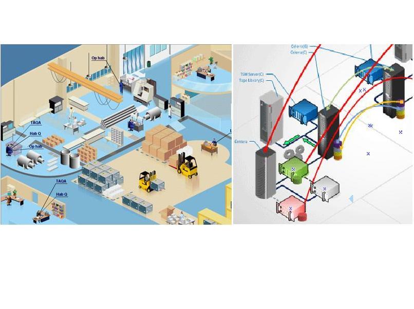
If I love Design (one day I will show a part of my collection), I do love 3D.
Here are two beautiful art items that demonstrate the magnificence of perspective
(Allegories of Istanbul and Baghdad cities architecture).
Most of the time, 3D doesn’t bring nothing to charts. On the contrary, it hides other forms (needing a rotation function in order to see other shapes behind a large one in the front). On top of that, perspective crushes the height of objects in the background.
The only time 3D is positive is for diagrams (where direction and way are meaningful) and for maps. But not many tools are able to generate these powerful graphics (Very adaptable, BeGraphic handles all graphics : charts, diagrams, maps, graphs, pictures… and even mix them).
On charts, if you want to show a third dimension, use lines thickness (or scaling color intensity).

