Only two charts exist in Microsoft Excel

May 14th, 2010

(The best hidden secret in Data visualization)

Would you trust a shortsighted doctor that knows only two pills? Of course not!

Well, most data visualization experts(*) give advices about the best graphics among the 72 charts included in Excel… without seeing that these 72 are only variants of two basic ones : univariate (on rail) and bivariate (XY plane).

.

I Charts on rail

Do you know what is an Equalizer? It’s a table full of rail-mounted buttons. Well 84% of Excel charts are variants of this fundamental data visualization. Let me explain it to you

1. First we have to select the button’s shape

You can choose to visualize

· only the position to show (dot plot)

· or the entire column (e.g.: column, 3-D column, cylinder, cone, pyramid…)


univariate

Click here (and wait few seconds) to see animated explanation on these charts on rail.

2. Then we must choose the type of rail

The rail can be made of

· parallel lines : vertical (column), horizontal (bar)

· several radiant lines(radar), centered from a single point

· half-circular (gauge, speedo-meter, odometer), highlighted by the needle

· circular (pie chart, doughnut), emphasized by the colored slice

univariate on rail

Click here to see different types of rails for univariate charts.

3.Last, we can add some options, mainly two.

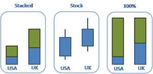
· several data on the same rail :

o from the basis (stacked column), usually from “zero”

o from another position (e.g.: stock charts, Japanese candlestick, box and whisker, Gantt, Cascade/Waterfall)

· 100%, to put all columns in percentage.

options of univariate

Click here to see main options of charts on rail.


.

II Charts on XY plane

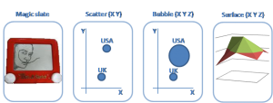
Do you remember playing with a magic slate? You only had to turn the buttons in each corner to draw your work of art, and then simply shake the board upside down to start again. Well 16% of Excel charts are variants of this fundamental data visualization. Let me explain it to you .

1. First we have to select the scales on the two axis (X and Y, also called abscissa and ordinate).

2. Then you plot data points

Each point has its

· two coordinates, making a complete chart (scatter)

· sometimes even three coordinates (this sub-category includes X, Y + Z), by making a 3-D data visualization (Surface) or a “Bubble chart” where the third dimension “Z” is represented by the bubbles’ size.

Click here to look at XY plane charts

Click here to look at XY plane charts

3. Last, we can add some options, mainly three.

· adding a line between points (Line chart, Gapminder with trace)

· under the line, highlight the area with a colored place (Area chart)

· Matrix (BCG matrix, ADL matrix, Magic Quadrant, contextual area)

.

Conclusion:

The following questions are:

· How many other data visualizations exist?

· Are there some smarter ones? (Answer is Yes. During next 12 months, BeGraphic will bring two truly innovative graphics).

· How can we add them inside Excel and PowerPoint (The popular business tools)?

This will be explained in a coming article that BeGraphic’s team has to finish. But right now by installing BeGraphic on your computer, you can add custom charting capabilities to Excel and PowerPoint.

.


*: The tiny world of self-claimed international experts is made of IT bloggers or self-published writers. Only the smarter made a non official “advertisement exchange” deal with chosen journalists.

So do serious data visualization scientists exist? Yes, European cartographers, who make maps for ages! Because during centuries, their question has been about how to densify information on paper, without being chaotic (fashionable people would speak about “Data-pixel ratio” and ergonomics). Are they famous? May be one: Jacques Bertin (born during the First World War, and still writing… “Mes respects à ce grand Monsieur”). I’d be curious to know how many of these so-called “experts” have entirely read his books before giving their opinion.

The most famous graphic (“Napoleon’s march”) is now dynamic in Excel

April 24th, 2009

Here is a perfect example of how an average user can make sophisticated data visualization, and do simulations with it (without any technical knowledge). See the video!

If we decided to show the famous “Napoleon’s March” graphic with BeGraphic, that’s because it is known as the best data visualization ever done. According to Mr Tufte (the data visualization guru), this representation is probably the best statistical graphic ever drawn. You can even buy it on Mr Tufte’s web site: http://www.edwardtufte.com/tufte/posters

It portrays the losses suffered by Napoleon’s army in the Russian campaign of 1812. Beginning at the Polish-Russian border, the thick band shows the size of the army at each position. The path of Napoleon’s retreat from Moscow in the bitterly cold winter is depicted by the dark lower band, which is tied to temperature and time scales.

This graphic made by Charles Joseph Minard (French engineer of the XIXth century. See an interesting gallery of his works: http://www.math.yorku.ca/SCS/Gallery/minbib/index.htm) is very powerful because :

  • Enforce Visual Comparisons

Lines’ Width gives you an immediate comparison of the size of Napoleon’s army at different times during the march (tan color for going to Russia and black for returning).

  • Show Causality

Map shows temperature records, explaining that weather and terrain defeated Napoleon much more than his enemies.

  • Show Multivariate data

Napoleon’s March shows six: army size, location (in 2 dimensions), direction, time, and temperature.

  • Use Direct Labeling

o Integrate words, numbers & images
o Don’t make user work to learn the “system”.

.

Please click on the following link to see the video :

Dynamic graph showing Napoleon in Russia (originally made by Mr Minard)

Flickr, our new way to store ideas about data visualization

March 9th, 2009

We have a new way to show new data visualizations.

http://www.flickr.com/people/begraphic/

.

But the question is about what to say in “My profile” ? Here is my current answer

BeGraphic is a dynamic diagrams tool inside Excel (also usable through PowerPoint).

This data visualization solution dynamically links graphical objects (*) to live data (amounts, font, color… inside spreadsheet’s cells) shown inside Excel. So BeGraphic helps you to build your own infographics by transforming any shape(*) into a live graph.

* : any graphical representation such as

  1. business process shapes, glyphs, free forms (e.g.: all forms inside the “Drawing” toolbar inside Excel/PowerPoint)… and any vector images (primarily converted to EMF format – because this is the only vector format supported by Microsoft Office)
  2. and all images allowed inside Excel and PowerPoint (jpeg, gif… and all raster formats supported by Microsoft Office), including maps, cliparts, pictures, photos…

BeGraphic includes 11 Core functions (on each shape/ form) :

  1. Color & Pattern
    (Give to the shape the same color and pattern that the cell’s ones)
  2. Line / Border
    (Give to the shape the color and pattern from a cell’s border)
  3. Text
    (cell’s text plus its color and font)
  4. Name
    (renaming a shape)
  5. Scale
    (reducing/enlarging a shape based on a cell’s value)
  6. Transparency
    (percentage of transparency based on…)
  7. Rotation
    (rotate an object with a specific angle…)
  8. Order / Level
    (hide/ unhide shapes…)
  9. Layer
    (group of shapes that can be hidden, re-ordered…)
  10. Action
    (when roll-over mouse or on clickable shape)
  11. Magnetization
    (shapes following a leader shape)

3D : better for Design than for InfoGraphics ?

November 10th, 2008

If I love Design (one day I will show a part of my collection), I do love 3D.

Here are two beautiful art items that demonstrate the magnificence of perspective
(Allegories of Istanbul and Baghdad cities architecture).

Most of the time, 3D doesn’t bring nothing to charts. On the contrary, it hides other forms (needing a rotation function in order to see other shapes behind a large one in the front). On top of that, perspective crushes the height of objects in the background.

The only time 3D is positive is for diagrams (where direction and way are meaningful) and for maps. But not many tools are able to generate these powerful graphics (Very adaptable, BeGraphic handles all graphics : charts, diagrams, maps, graphs, pictures… and even mix them).

On charts, if you want to show a third dimension, use lines thickness (or scaling color intensity).

Advertising people show data the right way. NeuroSciences proove it!

October 30th, 2008

Let’s be frank. We love to make new types of charts (by using macro in Excel for example), much smarter ones than average pie or bar charts. But will the decision be better with these new amazing graphs ?
Many of us will be affirmative : “The smarter your graph is, the clever you are”. Every data visualization guy knows that a 3D graphic doesn’t give precise values, that a pie chart is the worst thing because human eye doesn’t see the angles well, Et cetera…

Statisticians and IT guys often laugh at journalists designing infographics for the mass media and advertising people showing some gigantic numbers. These stupid flashy images can just be pictures for kids.

.

But today medical research demonstrates that advertising people are right. What they do by feeling for centuries is scientifically proven to be the right way. Nowadays we know that the brain is made of three distinct sub-systems emerged successively in the course of evolution and now co-inhabit the human skull :

  • The reptilian brain, the oldest of the three, controls the body’s vital functions such as heart rate, breathing, body temperature and balance. Our reptilian brain includes the main structures found in a reptile’s brain: the brainstem and the cerebellum. The reptilian brain is reliable but tends to be somewhat rigid and compulsive.
  • The limbic brain emerged in the first mammals. It can record memories of behaviours that produced agreeable and disagreeable experiences, so it is responsible for what are called emotions in human beings. The main structures of the limbic brain are the hippocampus, the amygdala, and the hypothalamus. The limbic brain is the seat of the value judgments that we make, often unconsciously, that exert such a strong influence on our behaviour.
  • The neocortex first assumed importance in primates and culminated in the human brain with its two large cerebral hemispheres that play such a dominant role. These hemispheres have been responsible for the development of human language, abstract thought, imagination, and consciousness. The neocortex is flexible and has almost infinite learning abilities. The neocortex is also what has enabled cultures to develop.

These three parts of the brain do not operate independently of one another. They have established numerous interconnections through which they influence one another. But with new medical technologies, we know now that the principal decision center is inside the reptilian old brain.

Therefore in order to make your audience take the right decision (after viewing your documents), you have to know the rules :

  1. The old brain is driven by emotions.
    Don’t hesitate to put surprising or attractive images. But more important, only bring information touching your audience.
    “People are egocentric” says the author of “Neuromarketing: Are there some Buy buttons”.
  2. The old brain “decides” on the basis of the gain vs. pain tradeoff.
    The two basic drivers of all behavior and decisions are: to seek pleasure and avoid pain. Marketing guru, Seth Godin illustrates through his Joy/Cash Curve that high value purchases often trigger increasing amounts of buying pain.
  3. The old brain is highly influenced by beginnings and endings.
    Research confirms that the beginning and ending of an event or experience alters our perception of the entire experience. Our initial impression becomes the “filter” for how we perceive what is to follow. The most recent experience leaves a final impression with greater weight. In few words, give simple messages and few data if you want people to remember them.
  4. The old brain is visually oriented and responds rapidly to images.
    From the moment we are born, we are able to see shadows and associate meaning to them. In communications, we are told that 65% of our how our message is received is through our eyes (or visual cues). Study after study has shown that someone’s first impression of you is based on your physical appearance. In each instance, it is our old brain rapidly responding to visual cues, not words. “We process and make decisions visually, without being aware of them,” Morin says. “Only later do we rationalize decisions we made.”
  5. The old brain understands only what is tangible, physical and concrete.
    According to Patrick Renvoise, the old brain is constantly scanning for what is familiar and tangible. It does not understand numbers or abstract terms, like “integrated approach” or “comprehensive solution.”
  6. Emotion trumps reason:
    Give us the right emotion to ride on, and we’ll buy what you’re selling. When we experience an emotion,it creates a chemical change in our brain, hormones flood our brain and change the speeds with which neurons connect, and it’s through those connections we memorize. We don’t remember anything if there isn’t an emotion attached to that experience.
    More information on http://www.eruptingmind.com/importance-vivid-imagery-persuasion/

How do you see infographics now ? Do you think your audience takes decision based on multi-variate statistical data or on good presentation ? Jack Welch (former Chairman and CEO of General Electric) said that the majority of his decisions were made next to the coffee machine in the hallway.

If you want to take advantage of neurosciences, may be it’s time to use BeGraphic to build your visual graphs.

Other sources :

Video about (not so) human psychology

Complete / Part 1

Complete / Part 2

Complete / Part 3

Data visualization : Who moved my truth ?

October 29th, 2008

Playing with the title of the famous book “Who moved my cheese?”, I’d like to speak about Truth inside data visualization :
(As everybody, I can tell you that the single Truth is… mine)

.

Can you tell me why you make charts and graphs ?

  • “Because it’s my job to generate them every month” would be a sad answer.
    Because with the PDCA best practice(*), your work should also be to analyze the data and even to go further by adding title and comments.
    * : the Plan-Do-Check-Act model is also known as Deming circle, learned at the Baldrige university.
  • “I have no idea”.
    Nothing can be done for you.
  • “Because I want to move my audience” shows that you prioritize efficiency in order to make your opinion being accepted.

Usually graphics are used because they are powerful actionable tools to communicate information. In this way, Gene Zelazny speaks about “author’s intention”.

Therefore where is the truth ? The only truth might be that you want people to react.

.

So your choice is between knowing the communication rules and being manipulated by them. Here are some examples :

  • showing blue color is made to relax people (think about the famous blue screen for Microsoft Windows fatal error) or mammals (a horse calms down quicker in a blue painted stalls).
    Proven by Mandel N. & Johnson E; in Journal of Consumer Research; 2002 september + Johannes Itten; in The Elements of Color; 1970 + Gueguen N., “The effect of glass color in evaluation of the thirst-quenching quality of a beverage” in Current Psychology Letters, 11, 2, 1-8
  • Adding fast pace music promotes memorization.
    From Gueguen N. “on-line Experiments” in “Methods of observation and experimentation”; 2004.
  • keeping the picture integrity (shape ratio) might mislead your audience when enlarged
    http://eagereyes.org/basics/Linear-vs-Quadratic-Change.html
  • … and I don’t speak about the obvious manichean opposition between White (e.g.: the young and beautiful virgin Princess Leia) and Black (e.g.: Darth Vader the villain).

.

So the search for truth in information representation is insane, but efficiency is the attainable target.

Data visualization : Distracting effects vs Ascetic naked sadhus

October 3rd, 2008

Whenever a data visualization blogger(*) don’t agree with your graphs, his main reproach will be that your graph has “gaudy and distracting visual effects.

* : Should I say “expert” just because the blogger spends time writing posts and exchanging comments on his friends’ blogs? Does speaking louder on the Web makes you clever ? Was Big Mouth Joe smarter than Albert Einstein ?

.

This blogger would be right if we were robots. Unfortunately for him (and his opinion presented as a theory), we are human; that is to say that :

  • we like shiny colors (unless you are mormon)
  • we like beauty (plastic surgery is a profitable market, isn’t it ?)
  • we are animal-oriented (Porsche cars ads still show attractive women)
  • we like new things (difficulties to find gadget stores around you ?)
  • we don’t store information as quick as an hard disk
    (ads for washing powders always repeat 7 times the brand’s name)

So diverting “the audience’s attention away from the data” can be a difficulty, but will never be a simple problem of lens. That may be the reason why we use advertising agencies or communication people… and not engineers or IT guys to show ideas and broadcast information.

.

Actually the issue is the audience (not the blogger’s opinion) :

  • How much time does the audience members have to catch the information ?
  • Who are they ? Why are they here ? What could make them move ?
  • What fits their opinion in your message (real experts could speak about Semiotics)

Until now the only way to be sure about what is received is testing (opinion poll, eye tracking systems…), even if neuro-marketing is coming with new concepts. But this will be a future post.

Even The Wall Street Journal uses headlines! (More Pixel per info).

September 25th, 2008

.

Dear charts experts and data visualization specialists, this first post is for you.

I know that you have listened to John Peltier, Jorge Camoes, Stephen Few… But it’s time to read again Florence Nightingale, William Playfair and even Raymond Loewy! Before calling heretics the ones who are using more pixel per information, don’ make the same mistake as the medieval Inquisition who had this narrow-minded vision of what said the Bible and what should be done. Thinking too technically or even too mechanically cannot help you to understand the aesthetic part of Edward Tufte’s work.

Inside our company, we have one of the major european data visualization library. We don’t see a single truth. So please open your mind to many other theories (as there are many gospels in the Bible) such as Story-telling, Neuro-Marketing, Semiology, Chromoteraphy…

Stay tuned, because we will try to show new ideas.

http://www.bl.uk/onlinegallery/features/frontpage/homepage.html

Don’t forget newspapers are optimized for real people.